


Table of contents
- After introspection meetings with the client, we came up with the below goals
- Defining our target users
- User journey flows
- Information Architecture
- We studied 8+ competitors in the real estate space to get insights
- 18+ iterations of mid-fi wireframes
- Style guide
- Overview of the high-fi UI
- Alignment and grid
- Accessibility considerations
- Prototype
- Key takeaways
- Future versions
- Thanks for reading! ✨
Bren is a mobile app to help Bren keep a steady line of communication open with existing owners who have paid the booking amount for an apartment.
Stakeholder interviews
User journey mapping
Information Architecture
Competitive analysis
Mid-fi wireframes
High-fi UI
High-fi prototype
Testing
💡 Tools: Figma
💡 Deliverables: Native mobile app (iOS)
💡 Timeline: 2 months
💡 Category: Real estate
💡 The team: 2 designers, project manager, tech lead, marketing associate, 2 software developers
💡 Role: Research, UX, UI
After introspection meetings with the client, we came up with the below goals
Increase trust in Bren customers for their interactions with Bren, post-purchase via accessible documents/records of their purchase and help users feel important and secure about the fact that the apartment they bought is right there in their pocket and they don't need to worry. This will help to reduce customer tickets.
The platform should also support cross-selling of other products and services.

Defining our target users
The users are well-versed in using digital technology and apps. Many users are from the tech industry.
The product is for people who have purchased an apartment from Bren.
Target users are middle-aged, highly educated couples with cosmopolitan tastes influenced by global brands.

User journey flows
Bren's existing owner’s first-time user experience
The owner will be able to view delivered and work-in-progress apartments purchased by them.
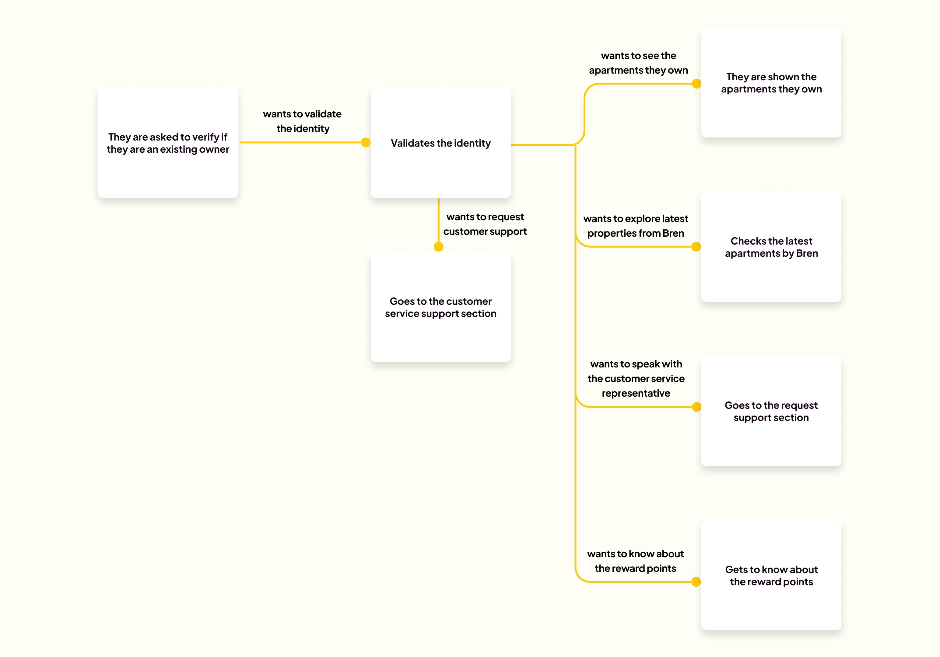
Rewards and referrals
The user can refer the project to other prospective buyers and if they make a purchase, the user can earn reward points through referral.

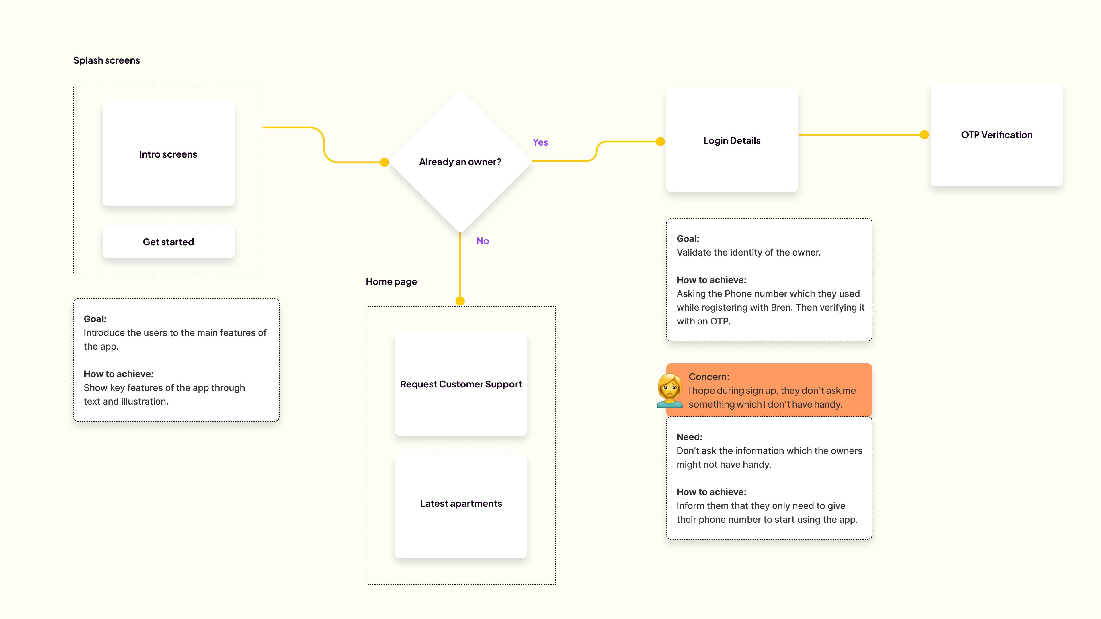
Information Architecture
At this stage, it is intended to break down the design of the entire app into various high levels of functionality. Within the overall system, each component serves a single purpose and only interacts with other essential elements on a need-to-know basis. It aids in the high-level visualization of app components. Due to space constraints, only a part of it is shown below.
We studied 8+ competitors in the real estate space to get insights
A variety of competitors were researched to see how they accomplished objectives that are similar to ours. Direct and indirect competitors include MagicBricks, CommonFloor, Makaan.com, Nestoria, Housing.com, 99acres, NoBroker, etc.
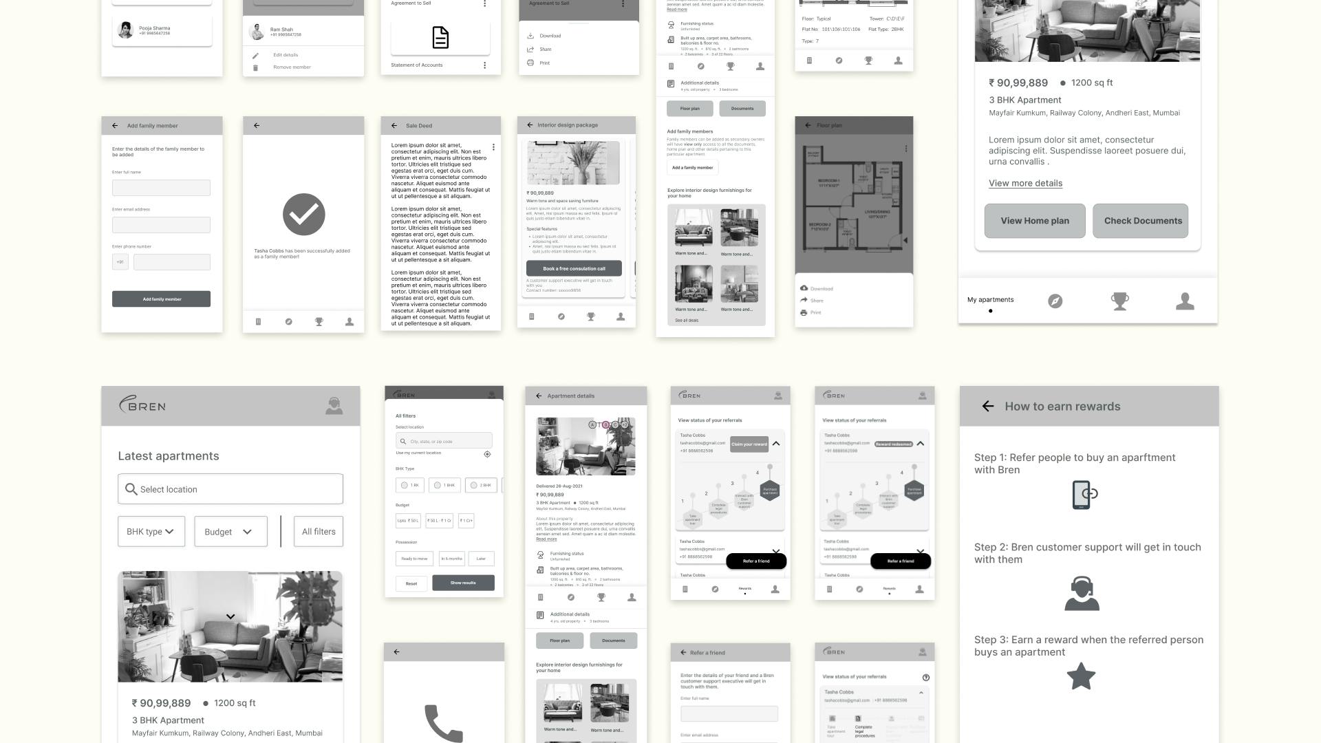
18+ iterations of mid-fi wireframes
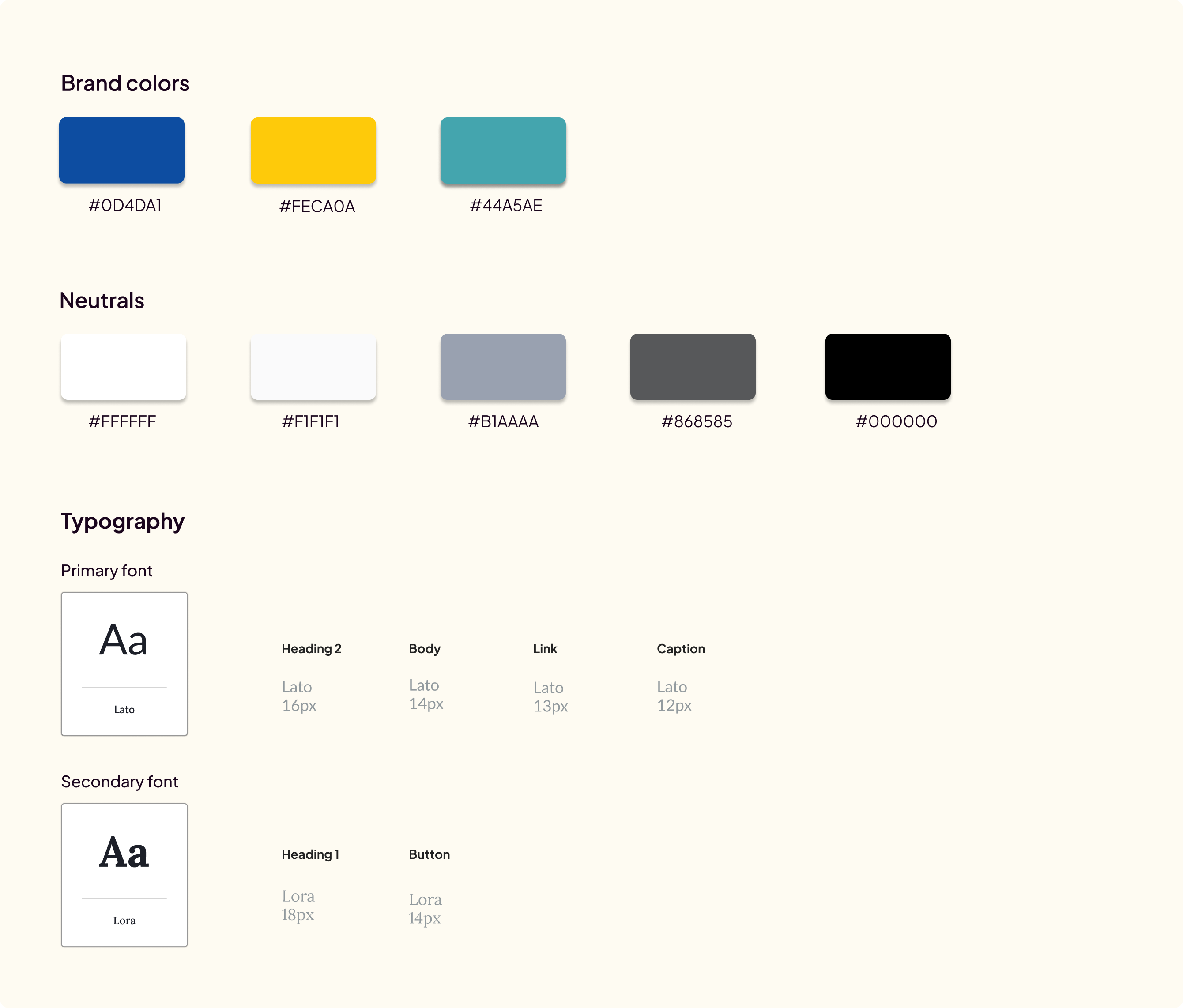
Style guide
Overview of the high-fi UI
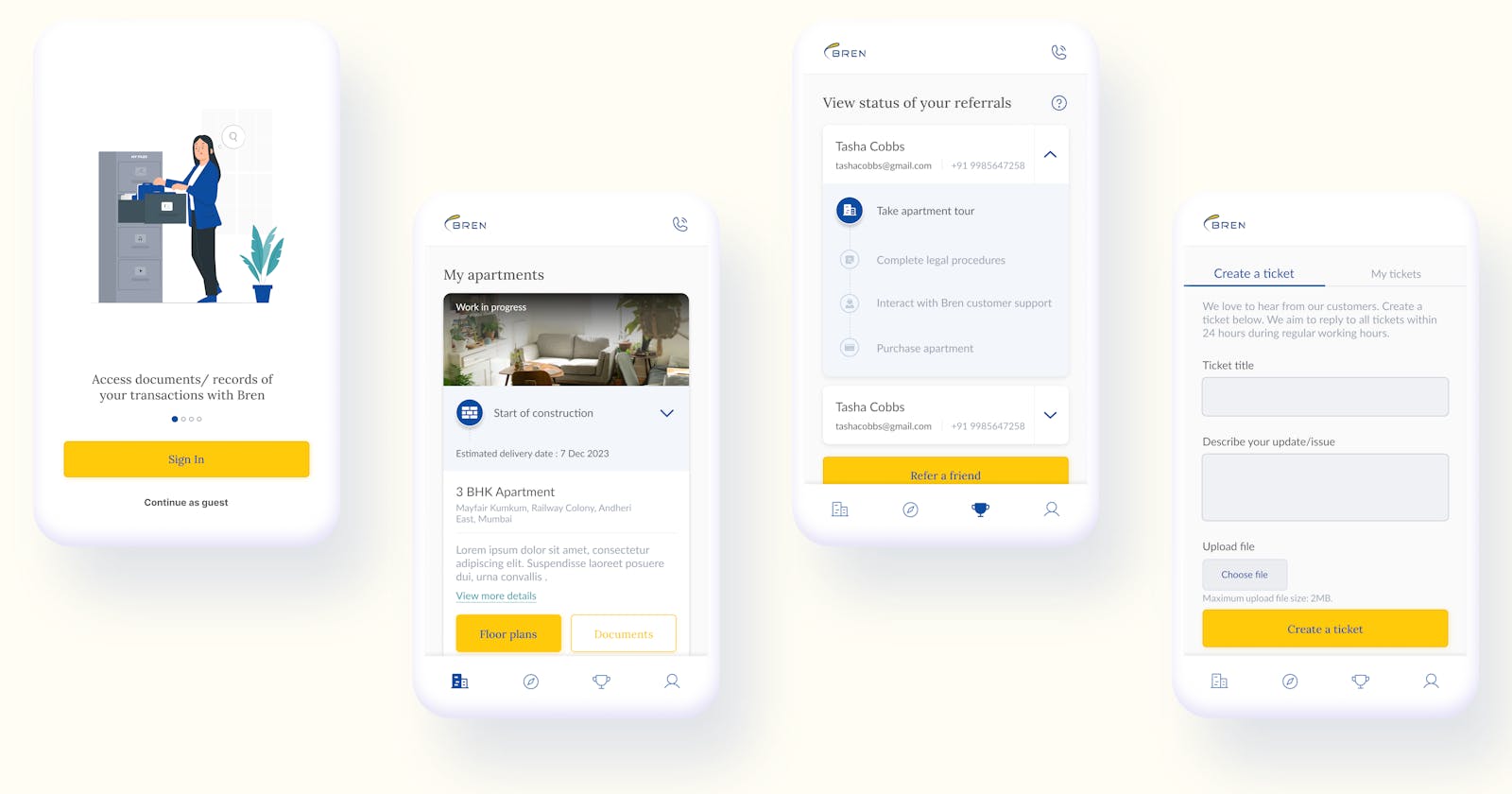
Home screen
The home screens display the delivered and work-in-progress apartments purchased by the owner. Each apartment is shown on a separate card which are vertically scrollable.
Initial iteration - It was initially decided to show the secondary owners at the top right corner of the apartment cards.
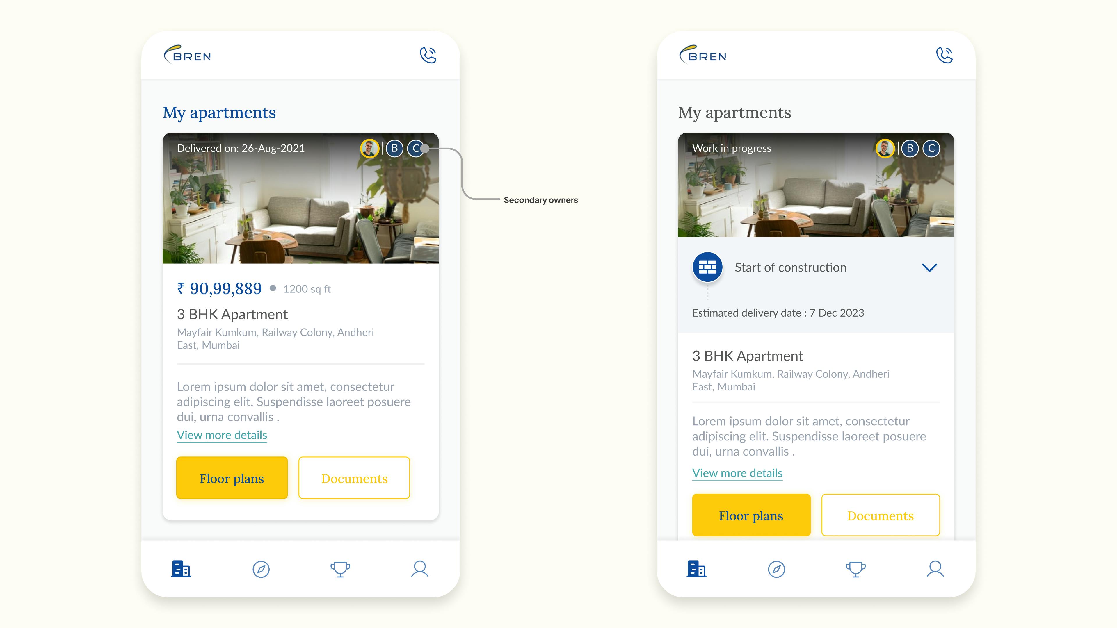
Final design - The secondary owners, which were earlier shown at the top right corner of the apartment cards, was removed after testing it with users as it was realized that it wasn't intuitive enough.
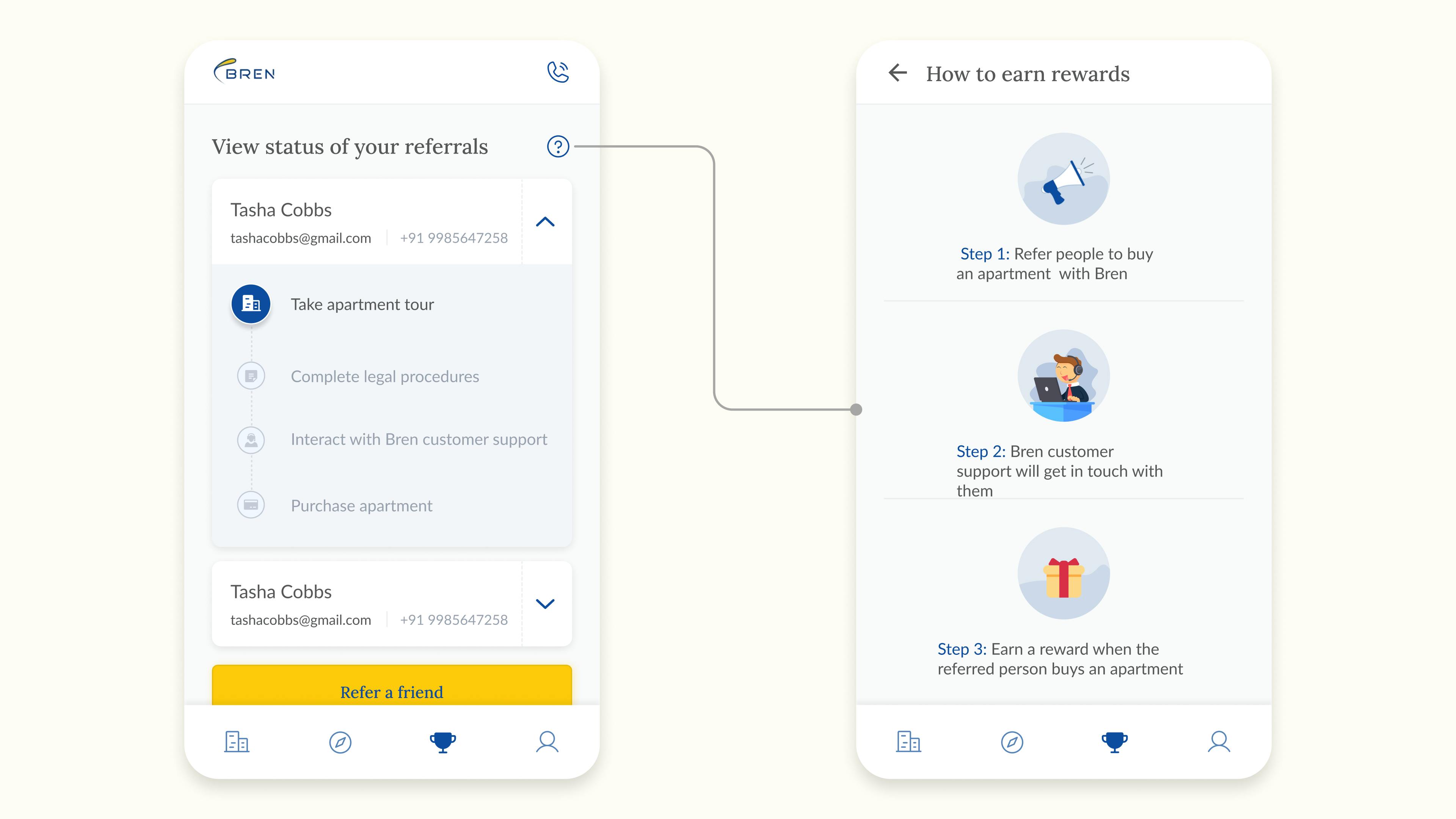
Rewards and referrals
If the user wants to refer a person who they think will purchase an apartment with Bren, then a ticket will be created and the Bren customer support will get in touch with them. The status of the referrals can be viewed.
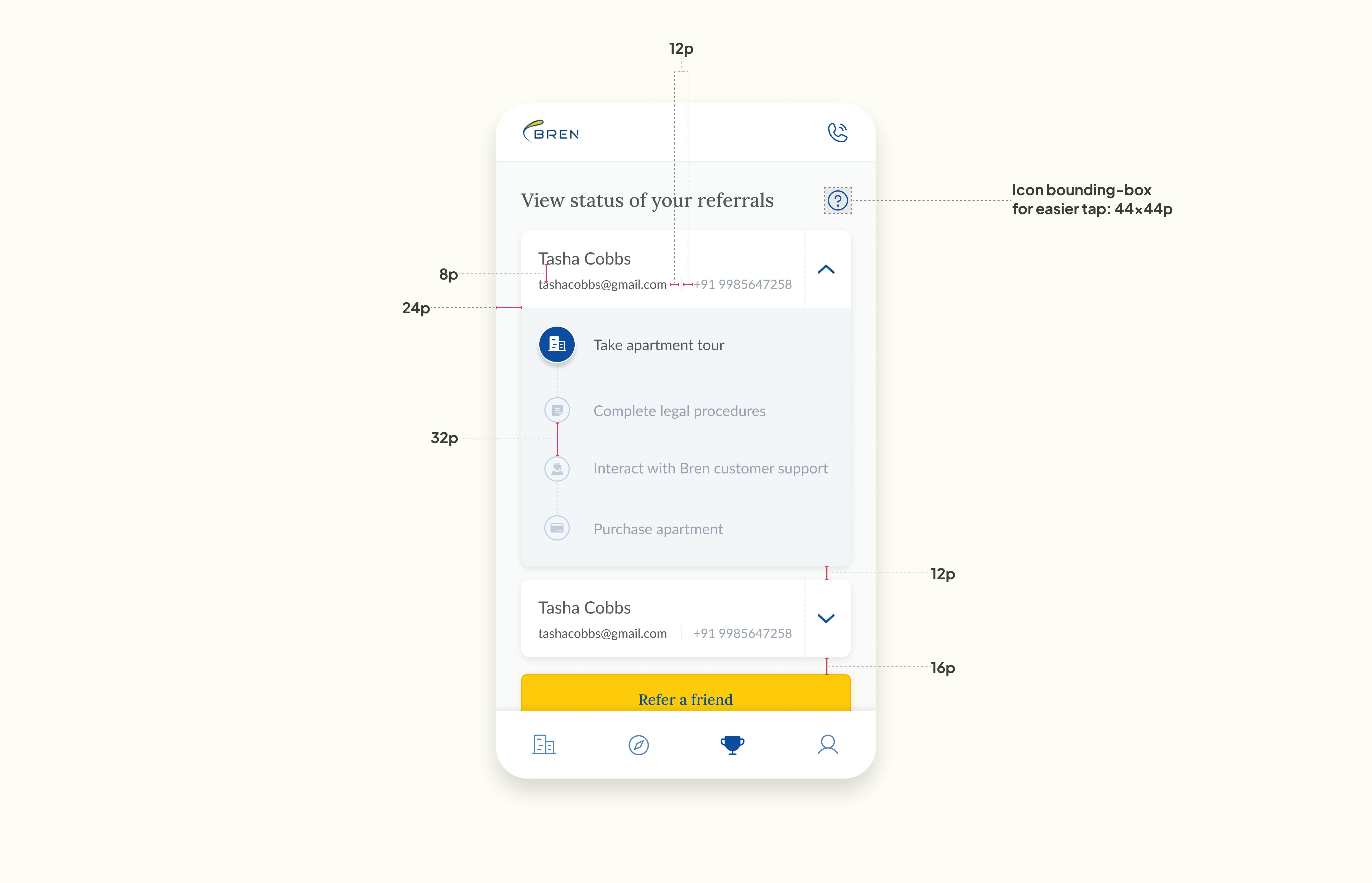
Alignment and grid
An 8-point grid was picked for the project and the margins within groups were set at 8 and 16, with margins between groups at 24, 32 and 48.
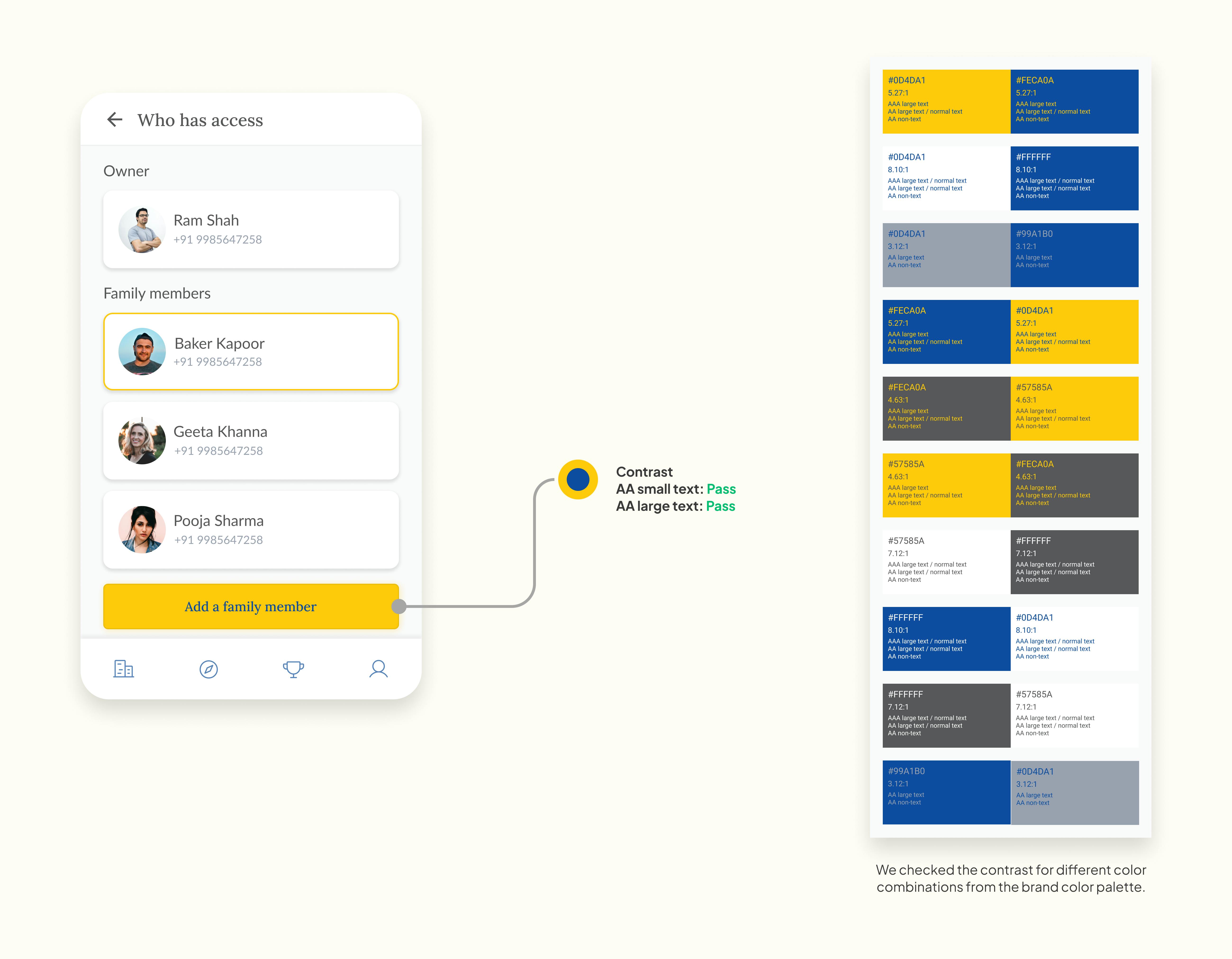
Accessibility considerations
The app has been evaluated for contrast to match the AA standards of WCAG.
Sufficient contrast between the text and its background. Colors were used which meet the WCAG requirements so that it is accessible to all users.
Easy navigation icons were used.
Prototype
Key takeaways
📌 One step at a time: The MVP was designed, thus the project duration wasn't a long one which would otherwise take months to be completed. This way, the focus could be on the key features of the app. And it will be built upon depending on the feedback received and customers' needs. This will give the right insights and enable informed design decisions to be taken for future versions of the app.
Future versions
Feedback gathered from early adopters will be beneficial in designing future versions of the app.